CO2 emissions information visualization
An information visualization project that seeks to help users visually answer a few questions regarding the data trends in a CO2 emissions dataset of academic laboratory work travels with all identifying information anonymized using Game of Thrones character and location names.
I worked with Moncif Toubouh on this project, each producing a visualzation using D3.js giving a separate insight.
moncif's visualization
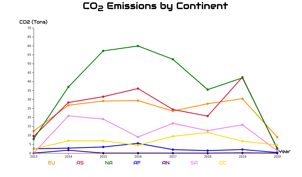
This visualization provides a global insight on how the CO2 emissions are distributed across continent destinations over the years as well as a comparative one between different continent destinations. This visualization consists of a graph line per continent destination where years are depicted over the x axis, as it is commonly the case, and the CO2 emissions in tons are depicted on the y axis. Each of the graphs is drawn with a carefully chosen color so that each one can easily stand out to the eye from the others. The user can also show/hide specific graphs for each continent destination. Having all graphs of all continent destinations in one plot depicted in different colors helps understand the general trend of emissions over the years per continent destination in a glimpse. In particular, the ability to individually show/hide specific graphs makes it possible to easily scan trends for select continent destinations of interest to the user and compare trends between them.
my visualization


This grouped bar chart provides explains how different decompositions of travelling researchers (i.e by region, house, title, rank, and institution) impact CO2 emissions. Given a decomposition of travelers, the x axis depicts categories in that decomposition. The left and right y axes depict the total and average emissions value in tons and kilograms, respectively, for each category. Each point on the x axis has two bars: one represents the total emissions for the category and the other represents emissions per user for that category. The user can change the decomposition from a drop down menu and the chart bars and axes will be dynamically updated. Having the ability to change the chart bar decompositions allows the user to explore visualize the CO2 emissions impact of each category in a glimpse. Finally, a category could have the largest amount of total pollution due to having the largest number of travelers and not due to inefficiency in travel plans and the average pollutions bar is here to capture that.